TATE MODERN
2. The expensive admission cost to museums in the United States certainly does stop people from attending them. The high prices are disappointing, especially after being in London and being able to experience all the museums for free. Having free admissions to British museums definitely adds some beauty and appreciation to the culture. It is shown all around Britain- in modern day architecture, color, and design- that all these different museums have a large impact on everyday life. I enjoy seeing the groups of school children at the museums because they are learning to appreciate such a beautiful aspect of life at such a young age.
 3. The Unilever Series is definitely a deep, unique piece of art. It is hard to understand the relevance at first glance, but when first approaching the exhibits there is definitely an overwhelming feel. To be an individual in a sea of so many faces is, just that- overwhelming. To believe in something enough to want to change it is, however, accomplishable. It may be more difficult than any one person could imagine, but one step at a time can begin to overcome any challenge. The work may not even be finished in your lifetime- but standing for what you believe in is not something to be underestimated. Seeing those collections of porcelein objects was suggesting strength in numbers, yet each small piece was unique and beautiful.
4. The white coloring between exhibits is definitely an enhancement of the images. Modern art is the only kind of art I can see this working for, because in order to truly appreciate some of the paintings you must be able to captivate each piece by itself. Any other sort of color, bordering, or design would interrupt with the ability to truly understand the work of art.
 5. The interior of the building was definitely impressive. There are some large modern works of art on display, and there was definitely enough space to not feel chlostrophobic. The inside was all very modern looking, beginning with the staircase that could be seen when you first walked in to the building. There were a lot of glass windows that let in sunlight to really accentuate the pieces. The outside I wasn't quite as fond of. It seemed a little dreary, though the location is absolutely awesome. I also really enjoyed traveling the Millennium Bridge before the entrance- I'm not sure if the placement of this bridge by the Tate Modern was on purpose or not- but it really enhanced the "modern" feel to the museum.
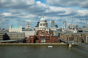
No comments:
Post a Comment